Overview · Ulifestyle HK
Getting web readers to adopt a new app — launched into a pandemic.
As UI designer for the Food section of Ulifestyle’s Hong Kong website, I worked alongside a project manager, marketing coordinator, programmer, and content creator. The goal was to drive users from the website to the newly launched mobile app — a launch that unfortunately coincided with the global pandemic, when many restaurants were closed.
Identifying the Challenges
The app couldn’t just mirror the website.
The app shares the website’s content, so it needed to create additional value to pull users out of their existing routine.
A one-time download isn’t enough — the experience had to be compelling enough to keep users coming back.
And it couldn’t make the website redundant; the two had to feel complementary rather than duplicative.
User Persona
”I want to relieve the stress of deciding what to cook after work.”
Google Analytics showed most readers are young and inexperienced cooks. They come to Ulifestyle mainly for restaurant recommendations and snack ideas, and rarely visit the recipe page — a gap that pointed toward content that’s more engaging and easier to act on.
Feature Objective
Build a daily habit out of existing content.
The objective was to create new value from content the site already had — giving users a reason to return daily for recipe inspiration.
Market Research
Three recipe experiences, mapped for what they got right and wrong.
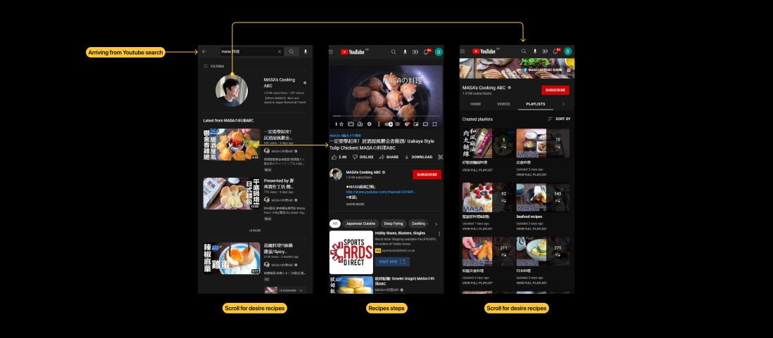
YouTube — content user journey
Pros
- No learning curve for everyday users.
- Almost impossible not to find relatable content.
Cons
- Categorisation depends entirely on how creators structure their playlists and uploads.
- New suggestions skew toward your existing watch history and the most-viewed videos.
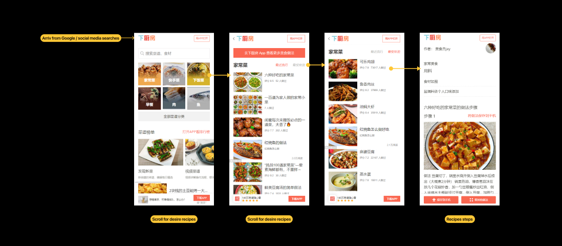
下厨房 — user journey
Pros
- A rich library of recipes.
- Clear, simple navigation to relatable recipes and suggestions.
Cons
- The volume can overwhelm beginners.
- Recipes can feel hard to make, with many steps and a lot of prep.
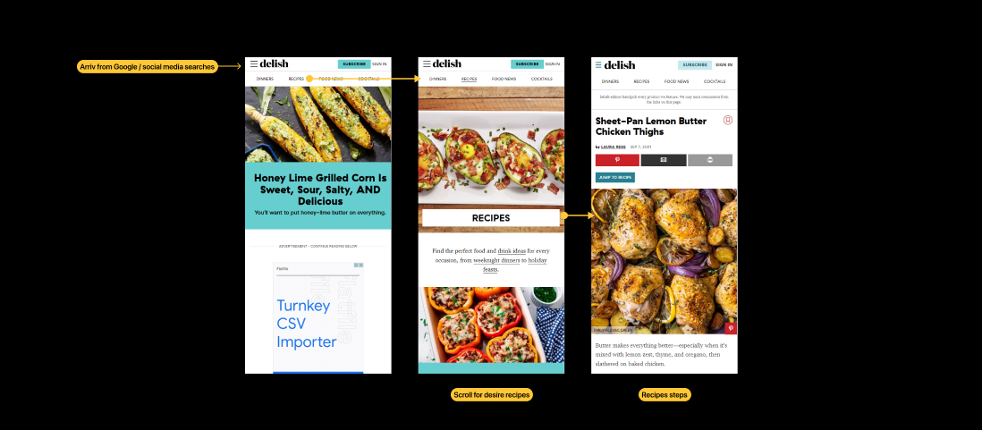
Delish — recipe search journey
Pros
- Combines video with step-by-step instructions.
- Clear, simple navigation to relevant recipes.
Cons
- Steps lack images — likely because video already covers them.
- Recipes are nested in groups, so users dig through several layers to reach directions.
Hypothesis
A shuffler could offer inspiration on demand, removing the stress of having to decide.
It should feel interactive — a distinctly different experience from the web version.
An element of surprise could be the hook that brings users back.
Design & Solution
A swipe-to-discover recipe shuffler — and the data to back it.
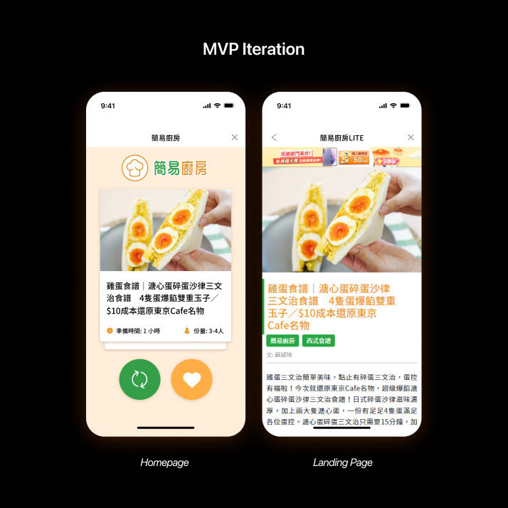
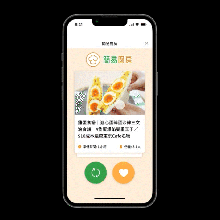
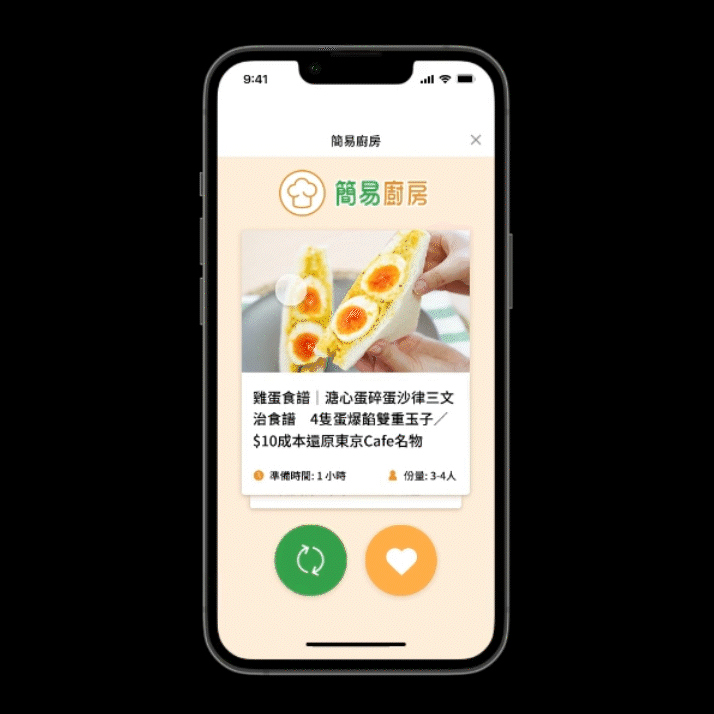
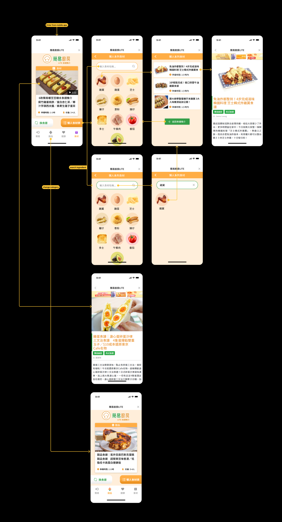
MVP
To test the hypothesis, I built a shuffler that works like Tinder — introducing a randomised element to finding recipes, as an alternative to the website’s infinite scroll.
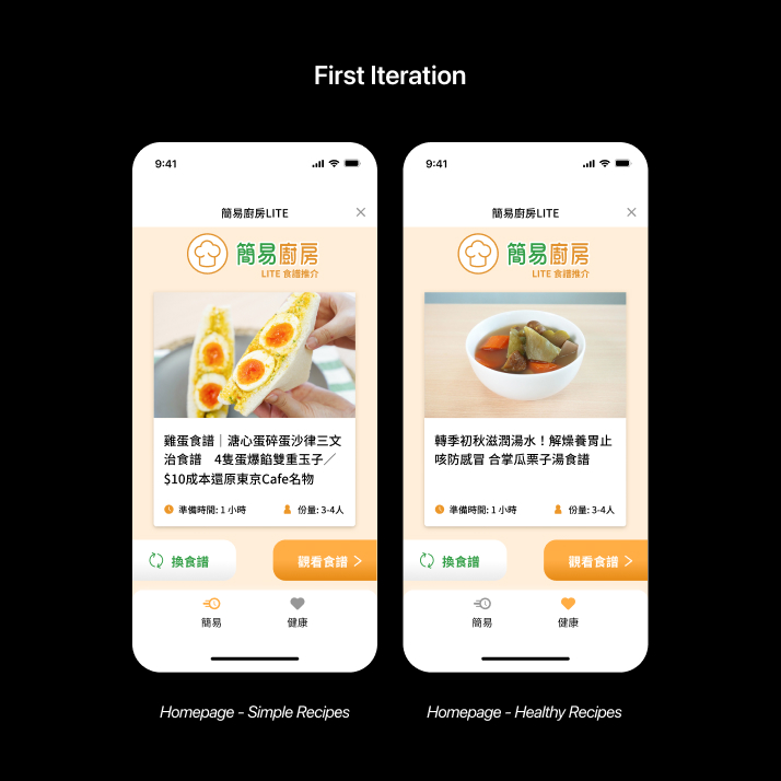
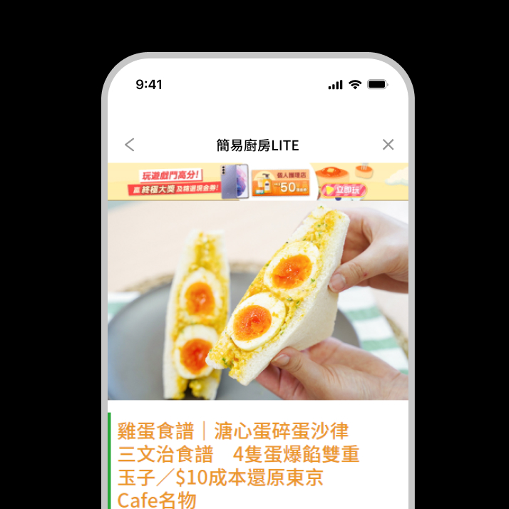
1st Iteration
The feature drew roughly 8,000 page views per week over its first two months. Labels were added beside the icons to make them easier to understand.
New categories were introduced for more choice, and the background card was removed for a cleaner look that declutters smaller screens.
2nd Iteration
A further pass added two more categories, widening the choices again.
The “view recipe” button was replaced with an ingredient filter — showing common household items in a fridge to suggest recipes you can actually make.